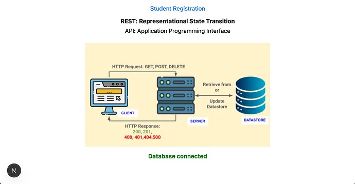
Size of image changes on deployment to vercel

Why does my image appear to shrink on deployment?

When I run the app locally, the image appears to be the size I specified for a laptop. When it’s deployed it shrinks quite a bit. The top image is deployed on Vercel.

You can see the app here: https://rest-api-postgres-vercel.vercel.app/
and code here: https://github.com/rebeccapeltz/rest-api-postgres-vercel

 <div style={{ width: "100%", display: "flex", justifyContent: "center", marginTop: "1rem" }}>
          <Image
            src="/images/rest_api_500.png"
            alt="REST API Diagram"
            width={500}
            height={281}
            style={{ width: "100%", height: "auto", maxWidth: "500px" }}
            sizes="(max-width: 500px) 375px, 500px"
          />
</div>

This is using Next.js and the Image component.

Hi, Rebecca! Welcome to the Vercel Community :waving_hand:

From what I can see, the issue comes from mixing fixed dimensions with responsive styles. Right now you’re setting width={500} height={281}, but also using style={{ width: "100%", height: "auto", maxWidth: "500px" }}, which ends up conflicting.

A simpler setup would be something like this:

<div style={{ width: "100%", display: "flex", justifyContent: "center", marginTop: "1rem" }}>
  <Image
    src="/images/rest_api_500.png"
    alt="REST API Diagram"
    width={500}
    height={281}
    style={{ maxWidth: "100%", height: "auto" }}
    priority
  />
</div>

This way the width and height props give Next.js the correct aspect ratio, while maxWidth: "100%" and height: "auto" let the image scale responsively without conflicts.

Could you give that a go?