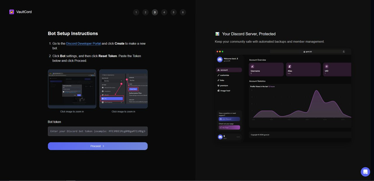
In my case it’s my own design, for me at least, as I’m using adobe XD and not Figma There is also the possibility that we might need to migrate a website from a stack to another etc. Anyway, it seems that your response is slightly off. v0 has a clear difference in understanding and the result has nothing to do with the need of copying or not someone else’s website.
Just today I’ve spent almost $20 in trying to build a simple onepager with at least half of this going in v0 repairing it’s own mistakes… In the end I have nothing great. This is something I usually solved within 4-6 hours in the past.
Even so all the feedback that comes from long standing users seems to be ignored or treated disrespectful, most of the time. Like you did just now, with someone showing how the results differ and your response being “well it worked for me” like a typical development clichée. Not great customer support.
Trying to have a conversation to collect practical info to show the team how people are trying to use the product. I asked a question to understand the use case to figure out if I knew an alternative solution.
It’s really helpful when people share chat IDs or screenshots so I can flag them for further review. For example, the screenshots above were already shared with the team. Additional context (like what you shared about Adobe XD) helps give a better perspective on what “it doesn’t work for me” actually means.
It really didn’t get it right at all, there’s a black-to-grey background divide, the active step numbers are not pink when highlighted in the original picture, and I could go on about 10 other problems. I’ve submitted follow-up messages to v0 and it still doesn’t tackle it when directly queried.
You claim your replies are just to get an understanding, however many of your replies in this thread appear as bad-faith minimizations of the problem. How is it any of your business the reasons I need to clone a UI? This is extremely unprofessional and discounting customer’s needs that pay you $20/mo.
Simple question you never answered: Were v0’s capabilities on cloning screenshots changed 2+ months ago?
Also you never gave confirmation to me or others our chats would be reviewed and improved on. So the communication is really lacking and isn’t demonstrating to us any meaningful progress is happening
Fair use allows extremely similar visual appearances as long as the code to get to that point was different. We’re incorporating our own components into the UI and it’s going to make a distinctive product in the end.
You would think Vercel with it’s large legal budget would know this simple rule of law.
Oh and I’d like to note, these pictures were not made with v0. v0 in it’s current state is inadequate and could never make something that looks like this. v0’s pictures all blend in, lacking unique characteristics or originality. every v0 generation looks like the same bland, emotionless page.
Good of you to openly share your screenshots so I could show the team what didn’t work like you expected. Please keep in mind our code of conduct in future posts.
In this thread, I’ve been trying to collect usable info for the v0 team and offer suggestions that might help people right away. Any more specific examples are welcome and appreciated.
It’s been absolutely getting worse. In fact I would describe it as dog ****.
It went from the place where I would go to in order to get a good first draft for a layout, to a place where I come to get perpetually disappointed.
And it seems like Lovable is in a similar spot (though I used that way less) so it’s possible that it’s more related to the underlying model.