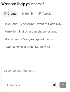
As v0 uses shadcn/ui for its components, almost all of its styling can be controlled via a single globals.css file that looks something like this
- you can control the whole color palette to use your brand colors
- typography, spacing, borders, rounded corners, are all configurable
One of the great things about this format is you can copy/paste it from v0 into any of your other projects that use shadcn and get instant results
:root {
  --background: rgb(235, 235, 231);
  --foreground: rgb(64, 64, 78);
  --card: rgb(248, 248, 247);
  --card-foreground: rgb(64, 64, 78);
  --popover: rgb(248, 248, 247);
  --popover-foreground: rgb(64, 64, 78);
  --primary: rgb(102, 54, 172);
  --primary-foreground: rgb(255, 255, 255);
  --secondary: rgb(217, 217, 211);
  --secondary-foreground: rgb(99, 98, 110);
  --muted: rgb(235, 235, 231);
  --muted-foreground: rgb(127, 127, 140);
  --accent: rgb(234, 230, 240);
  --accent-foreground: rgb(82, 82, 95);
  --spacing: 0.25rem;
  // many more
}

.dark {
  --background: rgb(53, 53, 58);
  --foreground: rgb(235, 235, 241);
  // many more
}

@theme inline {
  --color-background: var(--background);
  --color-foreground: var(--foreground);
  // many more
If you don’t have this file, you can ask v0 to create it for you. The shadcn/ui kit comes with a default one and v0 falls back to that (which is responsible for its standard aesthetic)
Customizing the theme
You can ask v0 to generate different color palettes for you, either by describing them in text or by pasting an image and having it base the design on what it sees in the image.
There’s also a cool community tool called TweakCN https://tweakcn.com/ that provides a more visual way to customize.
You can choose from some pre-made themes to get started, or if you sign in you can even prompt a custom one. That works pretty well in v0 too but this feels faster.
When you’re done you can click “Code” in the top right to get your CSS variables and paste them into v0.
Figma integration
When you connect Figma to your project, v0 will automatically pull in design tokens from your Figma project to set these variables for you.
That makes your future generations much more closely aligned to the original Figma file.
Customize markup manually
If these tokens aren’t enough control to get the exact aesthetic you’re looking for, you might need to dive deeper. Since the shadcn components live directly in your codebase, you can edit them to fully customize the final HTML.
By default you may not see them in your codebase – in the same way that the globals.css file is hidden by default, all shadcn components are hidden until you need to edit them. You can ask v0 at any time to customize one and it’ll reveal the file and make changes.
Keep an eye on the color classes that v0 generates for you. Sometimes it will use absolute colors like text-red-600 and you’ll need to remind it to use text-destructive instead so it will change when the theme does.
Final tweaks
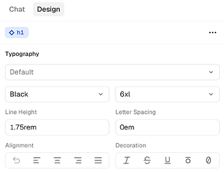
Once the overall aesthetic is in place, you can make final changes to the UI using v0’s design mode feature. These are manual controls that let you edit the page without using any AI credits or touching the code.


